
In the realm of user experience (UX) design, comprehending user needs and behaviors is paramount. This understanding serves as the foundation upon which effective interfaces are built. To truly grasp what users require, designers must engage in thorough research methodologies, including user interviews, surveys, and observational studies.
These techniques allow designers to gather qualitative and quantitative data that reveal not only what users say they want but also how they interact with existing systems. For instance, a designer working on a mobile banking app might conduct interviews with users to identify pain points in their current banking experiences, such as difficulty in locating transaction histories or navigating through various features. This insight can lead to targeted improvements that enhance user satisfaction.
Moreover, understanding user behavior extends beyond mere preferences; it encompasses the context in which users operate. Factors such as the environment, device type, and even emotional state can significantly influence how users interact with a product. For example, a user accessing a fitness app during a workout may prioritize quick access to workout routines over detailed analytics.
By observing these behaviors in real-world scenarios, designers can create more intuitive interfaces that align with users’ immediate needs. This holistic approach ensures that the design is not only user-centered but also contextually relevant, ultimately leading to a more engaging and effective user experience.
Simplifying Navigation and Information Architecture
Effective navigation and information architecture are critical components of any successful digital product. A well-structured navigation system allows users to find what they need quickly and efficiently, reducing frustration and enhancing overall satisfaction. Designers must prioritize clarity and simplicity in their navigation schemes, ensuring that users can intuitively understand how to move through the interface.
For instance, a website for an e-commerce platform should categorize products logically, using clear labels and a hierarchy that reflects user expectations. If users can easily locate categories like “Men’s Clothing,” “Electronics,” or “Home Goods,” they are more likely to engage with the site and complete purchases. In addition to clear categorization, designers should consider the placement of navigation elements.
Research indicates that users often gravitate toward familiar layouts, such as top navigation bars or side menus. By adhering to these established conventions, designers can minimize the learning curve associated with new interfaces. Furthermore, incorporating breadcrumb trails can enhance navigation by providing users with a clear path back to previous pages or categories.
This not only aids in orientation but also empowers users to explore the site without fear of getting lost. Ultimately, simplifying navigation and information architecture fosters a seamless user journey that encourages exploration and interaction.
Utilizing Consistent and Familiar Design Patterns
Consistency in design is crucial for creating a cohesive user experience. When users encounter familiar design patterns across different platforms or applications, they can navigate interfaces with greater ease and confidence. Designers should leverage established conventions—such as button styles, color schemes, and typography—to create a sense of familiarity that enhances usability.
For example, using a standard blue color for hyperlinks is a widely recognized convention that signals interactivity. When users see this color, they instinctively understand that they can click on it for more information or to navigate to another page. Moreover, employing consistent design patterns helps reinforce brand identity while simultaneously improving usability.
A well-known example is Apple’s use of its Human Interface Guidelines, which dictate how apps should look and behave on iOS devices. By adhering to these guidelines, developers create applications that not only align with Apple’s aesthetic but also provide users with a predictable experience across different apps. This consistency fosters trust and encourages users to engage more deeply with the product.
In contrast, inconsistent design elements can lead to confusion and frustration, ultimately detracting from the overall user experience.
Providing Clear and Concise Feedback
| Feedback Metric | Value |
|---|---|
| Number of feedback sessions conducted | 25 |
| Percentage of employees who found feedback helpful | 85% |
| Average time taken to provide feedback | 10 minutes |
Feedback is an essential aspect of user interaction that informs users about the results of their actions within an interface. Providing clear and concise feedback helps users understand whether their actions have been successful or if adjustments are needed. For instance, when a user submits a form on a website, immediate visual feedback—such as a confirmation message or a loading spinner—can reassure them that their submission is being processed.
This type of feedback not only enhances user confidence but also reduces anxiety associated with uncertainty. In addition to immediate feedback, designers should consider the importance of error messages and guidance. When users encounter issues—such as entering an invalid email address during registration—clear error messages that explain the problem and suggest corrective actions are vital.
For example, instead of displaying a generic error message like “Submission failed,” a more helpful message would specify the issue: “Please enter a valid email address.” This level of clarity empowers users to rectify mistakes quickly and encourages them to continue engaging with the interface rather than abandoning it out of frustration.
Incorporating Gestures and Interactions
As technology evolves, so too do the ways in which users interact with digital products. Touchscreens have become ubiquitous, leading designers to explore gestures as a means of enhancing user interaction. Gestures such as swiping, pinching, and tapping can create more fluid and engaging experiences when implemented thoughtfully.
For instance, in mobile applications, swiping left or right to navigate between images in a gallery is not only intuitive but also aligns with users’ expectations based on their experiences with other apps. However, while gestures can enhance usability, designers must ensure that they are discoverable and easy to learn. Not all users may be familiar with specific gestures, particularly those who are less tech-savvy or new to a platform.
Therefore, incorporating visual cues or tutorials can help bridge this gap. For example, an onboarding process that introduces users to key gestures can significantly improve their comfort level with the interface. Additionally, providing alternative methods for performing actions—such as buttons alongside gestures—ensures inclusivity for all users regardless of their familiarity with touch interactions.
Prioritizing Accessibility and Inclusivity
Accessibility is a fundamental aspect of UX design that ensures all users, regardless of their abilities or disabilities, can effectively interact with digital products. Designers must consider various disabilities—such as visual impairments, hearing loss, and motor difficulties—when creating interfaces. Implementing features like screen reader compatibility, keyboard navigation options, and adjustable text sizes can significantly enhance accessibility for individuals with disabilities.
For instance, using semantic HTML elements allows screen readers to interpret content accurately, enabling visually impaired users to navigate websites more effectively. Inclusivity goes hand in hand with accessibility; it involves designing products that cater to diverse user groups beyond just those with disabilities. This includes considering cultural differences, language preferences, and varying levels of technological proficiency.
For example, providing multilingual support on a website can broaden its reach and ensure that non-native speakers feel welcome and understood. Additionally, using culturally relevant imagery and language can foster a sense of belonging among diverse user groups. By prioritizing accessibility and inclusivity in design processes, organizations not only comply with legal standards but also create products that resonate with a wider audience.
Testing and Iterating for User Feedback
User testing is an indispensable part of the design process that allows designers to gather valuable insights directly from their target audience. By observing real users interacting with prototypes or live products, designers can identify usability issues that may not have been apparent during the initial design phase. Techniques such as usability testing sessions or A/B testing provide concrete data on how users navigate interfaces and where they encounter obstacles.
For instance, if testing reveals that users struggle to locate a specific feature within an app, designers can iterate on the design by adjusting its placement or enhancing its visibility. Iteration based on user feedback is crucial for refining designs over time. The iterative process encourages continuous improvement by allowing designers to make incremental changes based on real-world usage patterns.
This approach not only enhances usability but also fosters a culture of responsiveness within design teams. By actively seeking feedback from users throughout the development cycle—whether through surveys, focus groups, or usability tests—designers can ensure that their products evolve in alignment with user needs and preferences.
Embracing Minimalism and Visual Hierarchy
In an age where digital clutter is prevalent, embracing minimalism in design has become increasingly important. A minimalist approach focuses on stripping away unnecessary elements to create clean and straightforward interfaces that prioritize essential content. This not only enhances visual appeal but also improves usability by reducing cognitive load on users.
For example, a landing page designed with minimal distractions allows users to focus on key calls-to-action without being overwhelmed by excessive information or competing visuals. Visual hierarchy plays a critical role in guiding users’ attention within an interface. By strategically using size, color contrast, spacing, and typography, designers can create a clear hierarchy that directs users toward important elements first.
For instance, larger headlines draw attention immediately while smaller text provides supplementary information without detracting from the main message. This thoughtful arrangement helps users process information more efficiently and encourages them to engage with content in a meaningful way. Ultimately, embracing minimalism combined with effective visual hierarchy leads to interfaces that are not only aesthetically pleasing but also highly functional and user-friendly.
FAQs
What is user interface design?
User interface design is the process of creating interfaces in software or computerized devices with a focus on enhancing user experience and usability.
Why is user interface design important?
User interface design is important because it directly impacts how users interact with a product or system. A well-designed user interface can improve user satisfaction, productivity, and overall experience.
What are the key principles of user interface design?
The key principles of user interface design include simplicity, consistency, visibility, feedback, and affordance. These principles help create intuitive and user-friendly interfaces.
What are some common elements of user interface design?
Common elements of user interface design include buttons, menus, icons, forms, typography, color schemes, and layout. These elements are used to create a visually appealing and functional interface.
What are some best practices for user interface design?
Best practices for user interface design include conducting user research, creating prototypes, testing designs with real users, following accessibility guidelines, and continuously iterating and improving the interface based on user feedback.
What are some popular tools for user interface design?
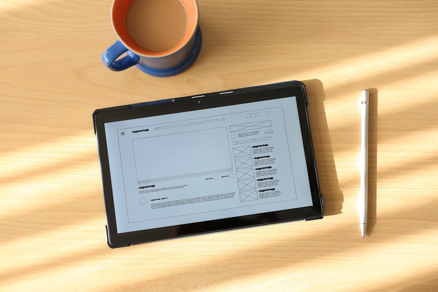
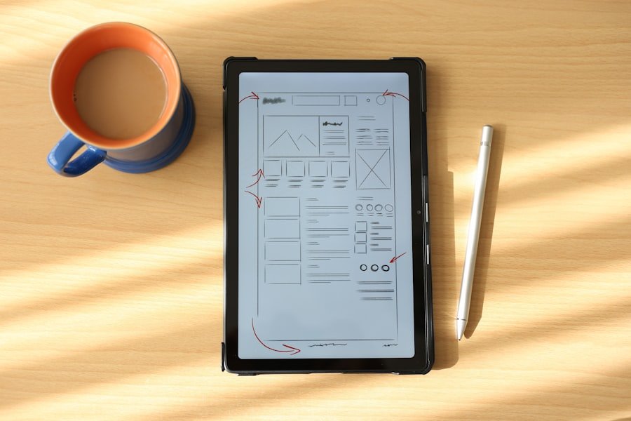
Popular tools for user interface design include Adobe XD, Sketch, Figma, InVision, and Axure RP. These tools are used for creating wireframes, mockups, and prototypes of user interfaces.